I attended an all-day workshop yesterday with Dave Snow of Constant Contact and I have about 7 pages of handwritten notes; I'm not going to share them all with you here but I am going to extract some of the best practices I learned about as they relate to sending email newsletters which the Regional is getting ready to do at the end of August.
When creating a Constant Contact eNewsletter:
All of this plus more training materials is on the Constant Contact website.
- Brand your eNewsletter so that it matches your other communications (website, business cards, etc)
- Tell your readers what you want them to do with the eNewsletter. What's in it for them?
- Always preview your eNewsletter without images before sending. 82% of email programs automatically block images. See what your readers will see.
- Incorporate a plan text version of your organization's name so you have instant brand recognition even if the logo is blocked.
- Use sans serif fonts but do not use Comic Sans MS
- Use 10pt font or larger
- Incorporate personal images - pictures of people and places your readers know/recognize
- Keep it short and sweet. eNewsletter should fit into an 8.5" x 11" piece of paper so the content appears above the scroll (ala above the fold)
- Incorporate videos - will keep your readers engaged longer
- Choose the template based on layout and purpose
- Create master templates. The more you copy from a copy from a copy of an eNewsletter in Constant Contact, the muddier the HTML gets. This causes formatting issues and frustration.
- Use colors that are consistent with your branding. Use 3-4 colors maximum.
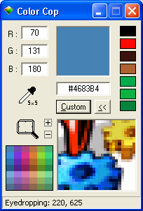
- Use ColorCop to find out what colors your website is using for your brand.
- Stick to 3 major articles per email - maximum. Use the space in the eNewsletter to place teaser content - hook your readers - then provide a link to the full document (PDF or Blog post). This helps keep the length short and the content interesting and eye-catching.
- Use a clear and/or clever subject line when sending the email - you don't need to say, "WMRL Wave eNewsletter Sept/Oct 2012." Instead, use the subject to tell them what's in it for them. Use action statements.
- Assign the eNewsletter its own email address (i.e. wmrl_wave@washcolibrary.org)
- Always use the SPAM check button before sending the eNewsletter
- Send emails on Tuesdays and Wednesdays between 10am-3pm (someone actually researched this...). But it's really up to your readers. Use the statistics/reports feature to find out when your audience is reading your emails and cater to them.
- Ignore the # of Opens. This figure means nothing, zero, zip, nada. It's worthless.
- Pay close attention to the # of Clicks. This is the most valuable number. The reports on this will show you who clicked what and when.
- It's a good idea to send a thank you note to whomever forwards your newsletter onto another person.


6 comments:
"Don't use Comic Sans" is great advice. How many fonts have their own warnings?
Also, that's a great tip about previewing your newsletter without images.
Thanks for your comments, Sam!
Comic Sans MS is horrendous and I actually wanted to post that bullet in Comic Sans but Google is so wonderful that I don't even have the option to choose that font in the WYSIWYG editor.
A workshop on font-appropriateness might be helpful ... why you should not use cursive font to write an email or a blog post, for instance ... or why you should? Hey, I'm open minded.
Spam Check?
nice information
Email marketing is best way to Constant Contact with customer. It’s very useful strategy to online marketing business.With the email you can provide the information to customer to you business offer.
Post a Comment